How Developers Without Design Knowledge Can Create Consistent UI with AI
If someone asked me what feels most difficult when building websites or apps, the first thing that comes to mind is design.
In the past, I might have thought, “Isn’t functionality more important than design?” But in practice, what first catches a user’s eye is often not a “well-built feature,” but a screen that “looks well made.” That does not mean functionality is unimportant. It is simply hard to deny that what users encounter first is not code, but the interface.
On top of that, designers are getting increasingly good at vibe coding these days. There are so many services now that look beautiful and work well. It feels like developers are entering an era where we either need to be able to build products that look reasonably good, or create products that are clearly differentiated in functionality even if the design is lacking.
In any case, there is no downside to making something look good, so I started thinking it would be useful to learn at least a little about design.
How can I design well… or rather, make AI design well?
That said, studying design from the ground up in a formal way felt too inefficient for me. In this era of agents, I decided to first look for ways to “make AI design well” rather than trying to “become good at design myself.”
I tried Figma AI and Stitch first, but simply entering prompts did not produce satisfying results in one shot. They were fine for getting layout ideas, but it was not easy to get output polished enough to apply directly to a real service. Of course, this may have been because I was not good at writing design prompts.
So I watched various design methodology videos on YouTube and looked into how actual designers use AI agents.
That was when I came across the idea of a design system.
The problem is not “taste,” but “making things concrete”
After learning about design systems, I started to understand why I had been struggling. The problem was not so much that I lacked design taste, but that I could not turn the vague image in my head into concrete rules.
A design system is a framework that defines the design elements a service will use in advance and helps keep them consistent. For example, it defines colors, font sizes, spacing, button styles, card shapes, modal designs, and so on.
AI agents often produce slightly different designs each time you ask. So instead of asking them to “make it pretty” every time, I learned that if you make them refer to a predefined design system, they can produce much more consistent results.
A design system does not solve UX for you
However, I handled the screen planning myself.
I first drew wireframes by hand, then moved them into Figma. Since this part is related to UX, I decided it was better to think through the user flow and screen structure myself rather than hand everything over to AI.
A design system is closer to a tool that makes UI implementation easier. Creating a design system does not magically produce perfect UI/UX without any planning. It is much better than starting from nothing, but you still need to decide where you are headed.
Creating and applying a design system
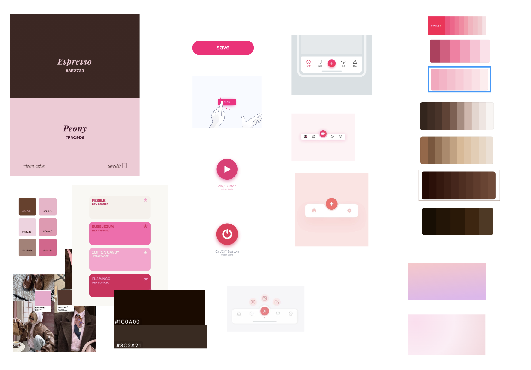
1. Explore references
First, I decided on the mood of the app I wanted to build.
At minimum, it is useful to define the following:
- The overall concept of the app
- Examples: simple, analog, dark, minimal, emotional, and so on
- Main color
- One or two supporting colors
You can collect references from Pinterest, or look for websites and apps you want to follow. The important thing is to gather visual material that lets you confirm, “This is the kind of feeling I want.”
AI also needs a reference point. Just as it would be awkward to tell a person, “Please just make it pretty,” AI will also make things however it wants if you do not give it proper direction.
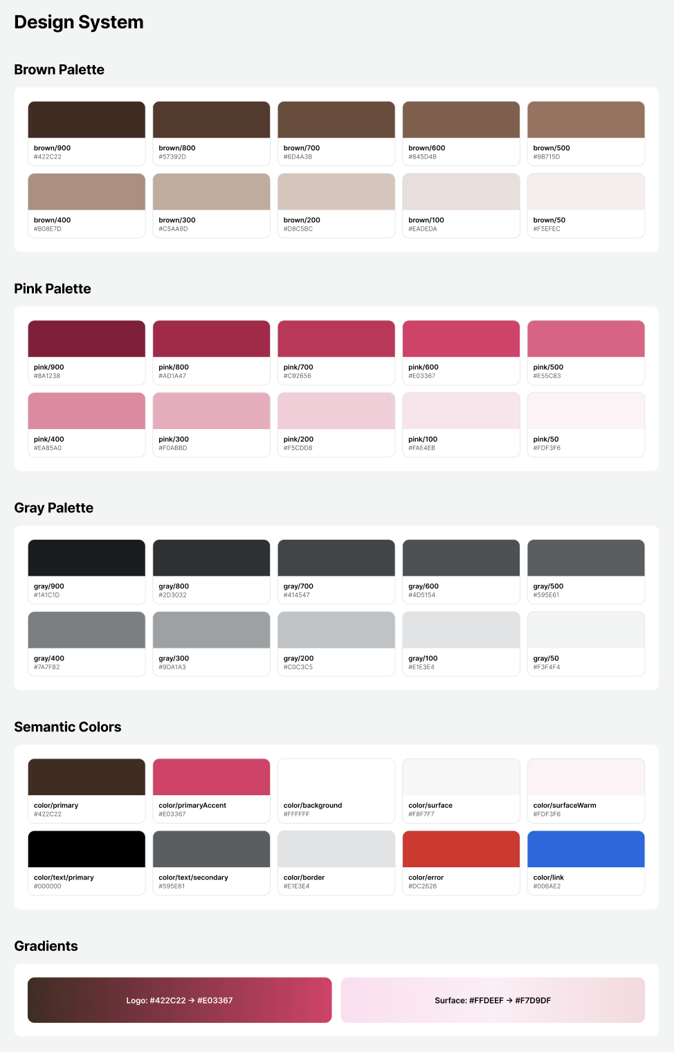
2. Create a design system with Figma MCP
After deciding on references and the concept, I connected to Figma MCP and asked it to create a design system.
At this stage, I kept checking the results in Figma and making adjustments. It is also helpful to prepare basic components like buttons, modals, and cards in advance, because it makes later work much easier.
If you search for design system prompt, you can find many examples of prompts for creating design systems. I used a GitHub prompt that appeared near the top of the search results at the time.
Design System Foundation Prompt
When creating a design system, it is good to check that it includes at least the following:
- Color Token
- Spacing Scale
- Typography Scale
- Radius
- Shadow / Elevation
- Basic components
- Button
- Input
- Card
- Modal
- List Item
- States for each component
- Default
- Pressed
- Disabled
- Error
- Loading
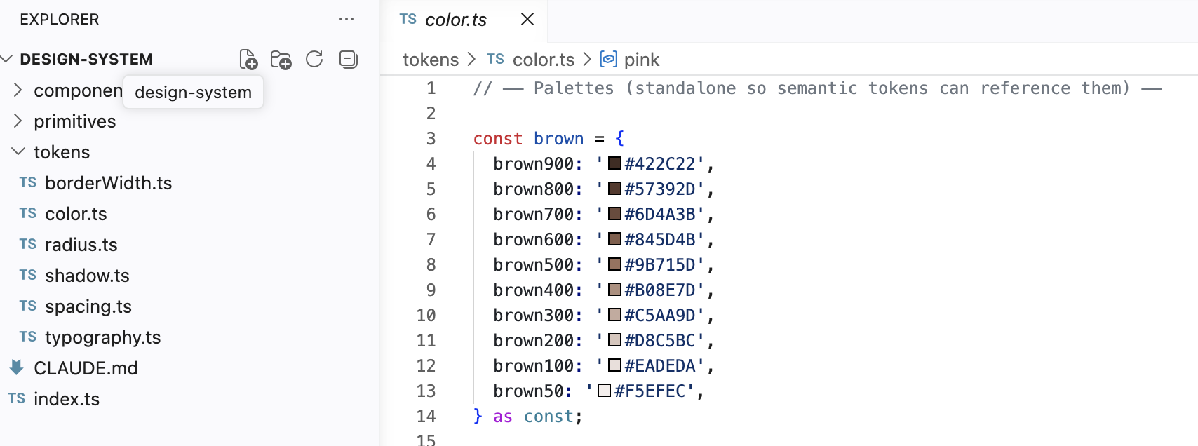
3. Turn the design system into code in the frontend project
Next, I connected Figma MCP from the frontend project folder and asked it to write code based on the design system implemented in Figma.
The important point here is to avoid hardcoding colors, font sizes, spacing, and similar values.
For example, if each button directly uses a color value like #3366FF, you will have to search through every file later when you want to change the main color. If you manage these values as design tokens instead, you can update them in one place.
I also asked it to create a Markdown file defining the design system in writing. With this in place, when assigning work to an AI agent later, I can give a clear instruction such as, “Implement this based on this document.”
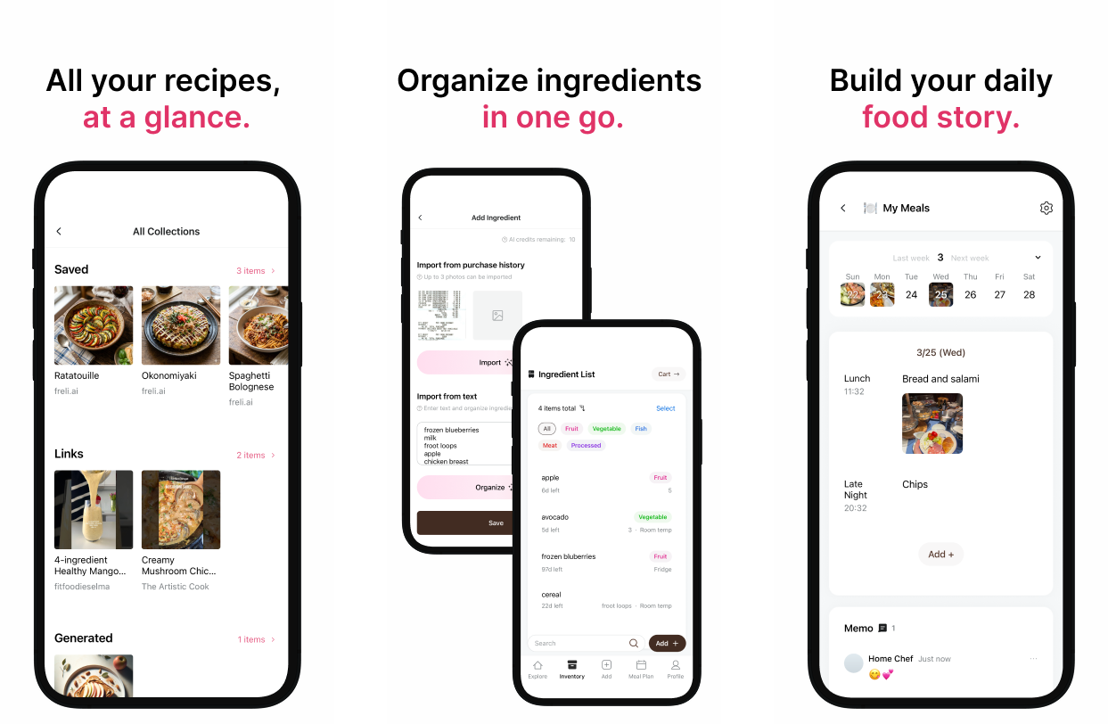
4. Apply it to the actual frontend screens
Finally, I applied the code-based design system to the actual frontend screens.
After that, whenever I modified the screen design, I kept checking whether it matched the design system. I already had app screens that I had planned myself in Figma, and most of the structure was fixed. So I was mostly in a situation where I only needed to adjust details such as spacing, font size, and radius.
The advantage of this approach is that it feels less like “designing from scratch every time” and more like “refining within a defined set of rules.” It also makes instructions to AI much clearer, and the results become less inconsistent.
Additional note: A method I used when creating a landing page
Developers often lack design knowledge, so it can be difficult to explain exactly what kind of design style they want.
The prompt introduced in the Reddit post below provides 25 different design styles, randomly chooses one, rewrites a detailed prompt for that style, and finally uses it to create a landing page.
Reddit - I made a prompt to generate unique beautiful landing pages
The downside of using a random approach is that you may need to try several times until you get the design you want.
So I first read the descriptions of the design styles defined in that prompt, chose a design philosophy I liked, and then asked AI to write a detailed prompt for that philosophy.
In other words, instead of immediately asking it to create a landing page, I first went through a meta-prompting process to make the design more concrete. After a few attempts, I was able to get landing pages that were closer to what I wanted.
Recommended resources
- I Built My Entire Design System in 4 Hours With AI. Full Tutorial (Claude + Cursor + Figma)
- How I Build a Production-Ready Design System with AI